Redesigining Temu Website
Tools: Figma, Miro, Heuristic Evaluation
Overview:
Temu, a fast-growing e-commerce platform, had key usability challenges: an overwhelming homepage, cluttered search results, and a frustrating checkout. This redesign aimed to create a smoother, more intuitive experience for budget-conscious shoppers using core HCI principles.

Problem Statement
“There’s just so much happening on each screen that it feels cluttered.”
Key Pain Points:
Homepage clutter & pop-ups
Irrelevant or overwhelming search results
Checkout friction & upselling
Minimal personalization in the user profile
Design Process
1. User Interviews:
We spoke with 4 users and ran a survey with 10+ responses to understand common frustrations.
2. Personas & Scenarios:
Defined key user types like “The Budget-Conscious Shopper” and “Tony the Busy Professional.”
3. Heuristic Evaluation:
Used Nielsen’s 10 Usability Heuristics to evaluate system flaws.
4. Prototyping:
High-fidelity wireframes in Figma for four key sections: homepage, search, profile, and checkout.
5. Usability Testing (Planned):
Next phase includes testing for validation and iterative refinement.
The Redesigns
Homepage
Simplified layout with fewer distractions
Grouped categories, prominent search bar
Subtle promotional banners instead of pop-ups
Impact: Easier navigation and less cognitive overload for new and returning users.

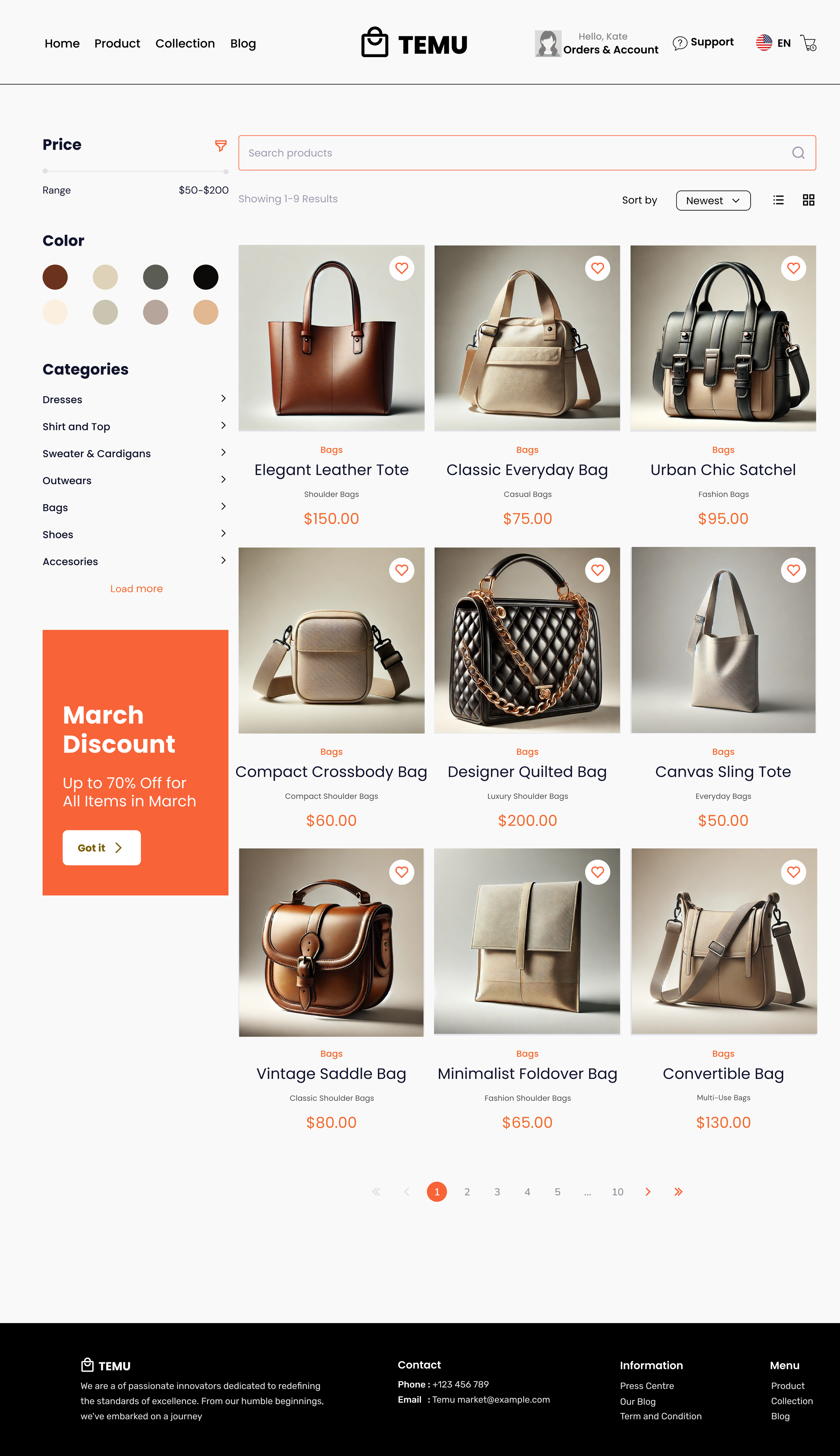
Search Results
Left-side panel with dynamic filters (brand, price, ratings)
Cleaner product cards with relevant info
Persistent breadcrumbs for easier category control
Impact: Faster product discovery and fewer irrelevant results.
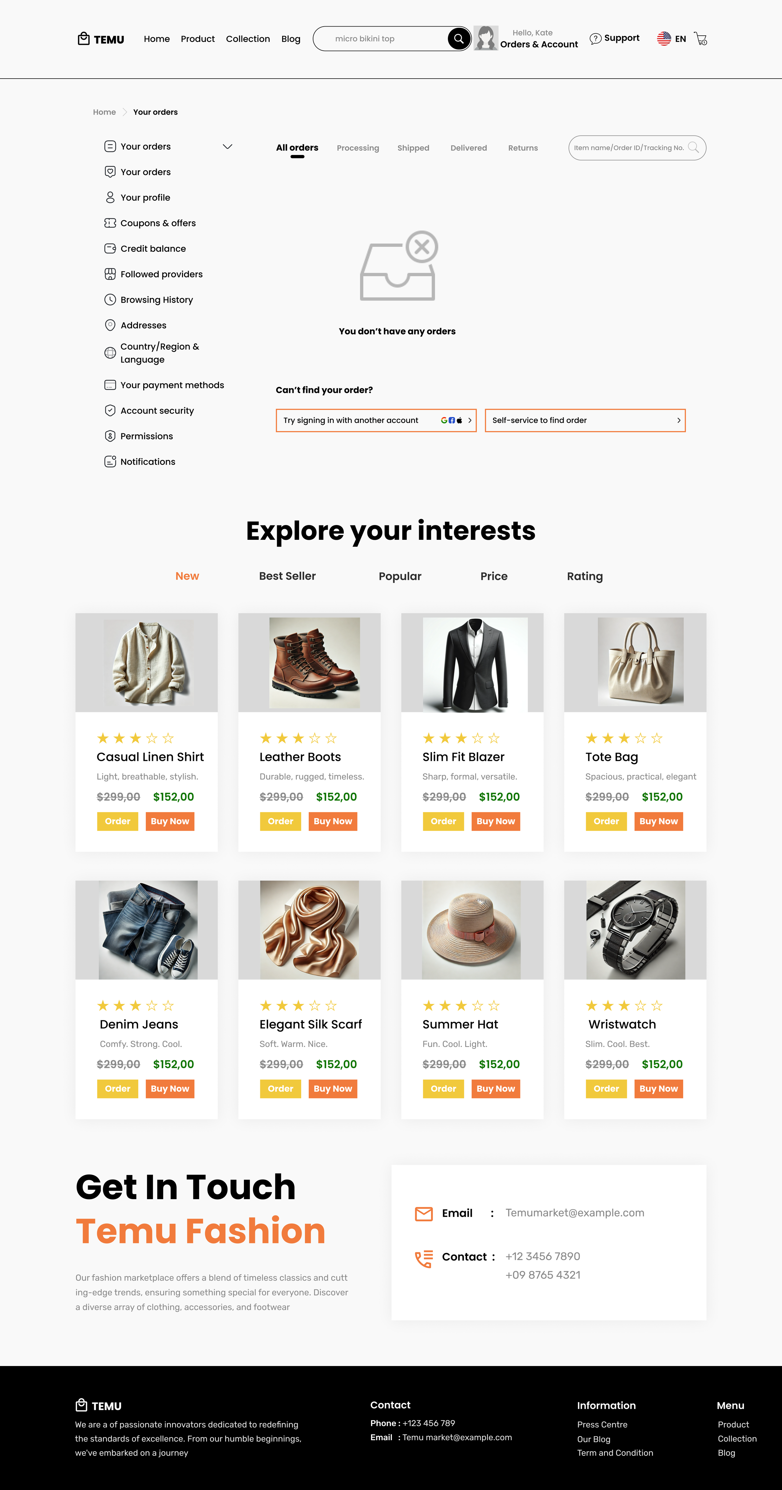
User Profile
Dashboard with order history, loyalty points, and saved items
Preference management (categories, notifications)
Personalized product recommendations
Impact: Builds trust and offers control through customization and transparency.
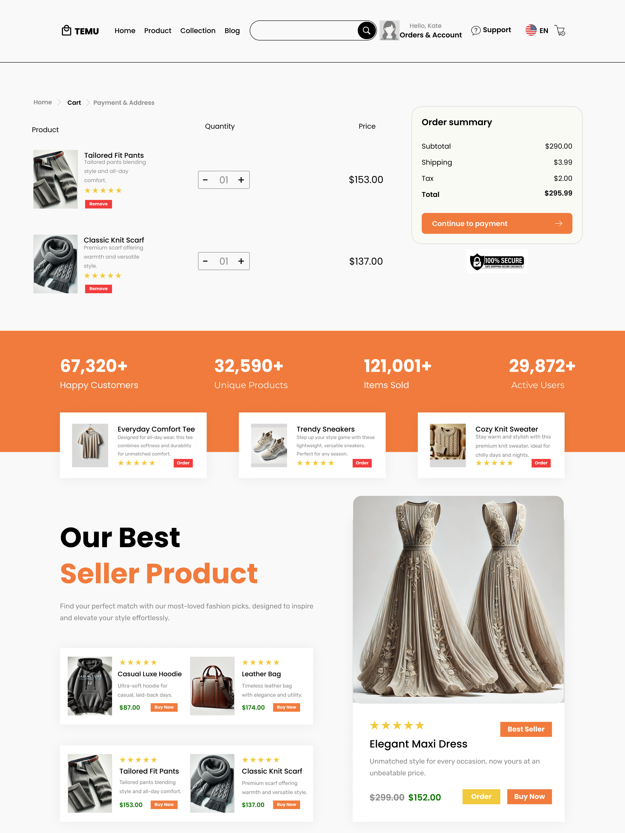
Checkout
Progress indicator from Cart → Payment → Review
Real-time error validation and transparent pricing
Fewer upsells, less friction
Impact: Reduced cart abandonment and more confident purchases.
Results & Takeaways
What We Improved:
✅ Task clarity and flow
✅ Search relevance
✅ Trust in checkout process
✅ Customization in user profile
Lessons Learned:
Design needs to simplify, not just beautify
HCI heuristics are essential in uncovering hidden pain points
Iteration based on feedback creates real value
Next Steps
Expand usability testing to broader demographics
Improve accessibility (keyboard nav, screen reader support)
Explore AR and voice-based shopping features
Acknowledgments
This project was developed as part of the INFO 508 Human-Computer Interaction course at Drexel University. I had the pleasure of collaborating with Suruchi Gokale, Marian Gasinu, and Sanjith Kumar, whose talent, insights, and dedication were invaluable throughout the process.